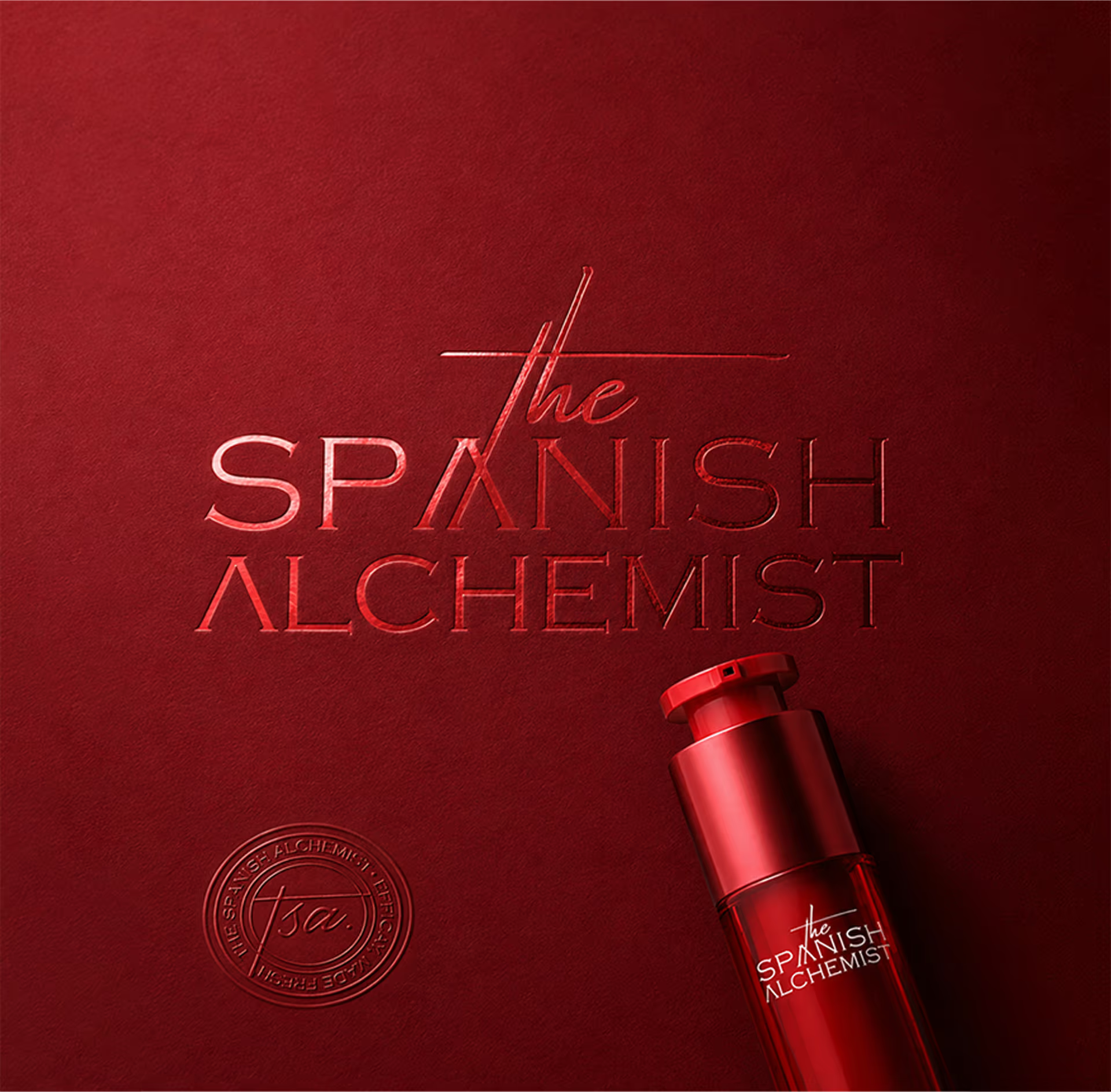
The Spanish Alchemist
Turning a fresh skincare idea from Alicante into a launch-ready brand, packaging, e-commerce, and digital system.
Naming / Identity System / Packaging / E-CommerceSocial Media / Email Marketing
Hari (Lead), Abhinav, Archana, Sreejith, Arun Anand, Vibish, Raunak, Kishor, Rahul
Rethinking freshness
in skincare.
When the project came to us, the task was to build a complete brand ecosystem around a clear idea of skincare made fresh, in smaller batches. And when we began exploring the project, what stood out was not just the product itself, but the larger contradiction surrounding the skincare industry. The category had become increasingly focused on shelf life, preservation, and mass distribution.
The challenge was more interesting:
how to make people believe in the idea of freshly made skincare.
Freshness is already a familiar idea in skincare. It is often used loosely to suggest something natural. But the brand’s idea of fresh was connected to the time closest to manufacturing, when the formulation is newly prepared, and the product is closer to its peak performance.
The challenge was not just to say “freshly made skincare,” but to help customers understand and believe what freshness actually means.
So we approached the project not as a conventional skincare identity but as a broader exercise in building a world around freshness, proof, and modern ritual.
From naming and identity to packaging, e-commerce, social media, email marketing, digital assets, and content direction, the project became a full brand system ready for launch, built around one question:
How do we make freshness feel real to the customer?
Naming the world before
designing it.
The name ‘The Spanish Alchemist’ was finalized after exploring multiple naming directions. It gave the brand a world that could hold both science and emotion. The idea of the alchemist brought in a strong creative base, hands-on experimentation, transformation, natural ingredients, ritual, precision, and the search for something rare. It also allowed us to build symbolic references such as the Philosopher’s Stone, the cycle of seasons, and the ritualistic nature of selfcare, helping us move away from the usual skincare language and build a brand that felt more distinct.


A personal identity with
a proof system.
The identity was built to feel both human and trustworthy. The brand did not have to look purely clinical. It also did not have to look overly soft, beige, or generic. TSA could sit in a more ownable space: freshly prepared skincare from its lab in Alicante, Spain, shaped with Mediterranean warmth.
The challenge was to create an identity that could work across bottles, boxes, stickers, seals, tissue paper, social posts, website pages, printed inserts, and emailers. TSA needed a flexible identity system.
Building the world of
the Alchemist.
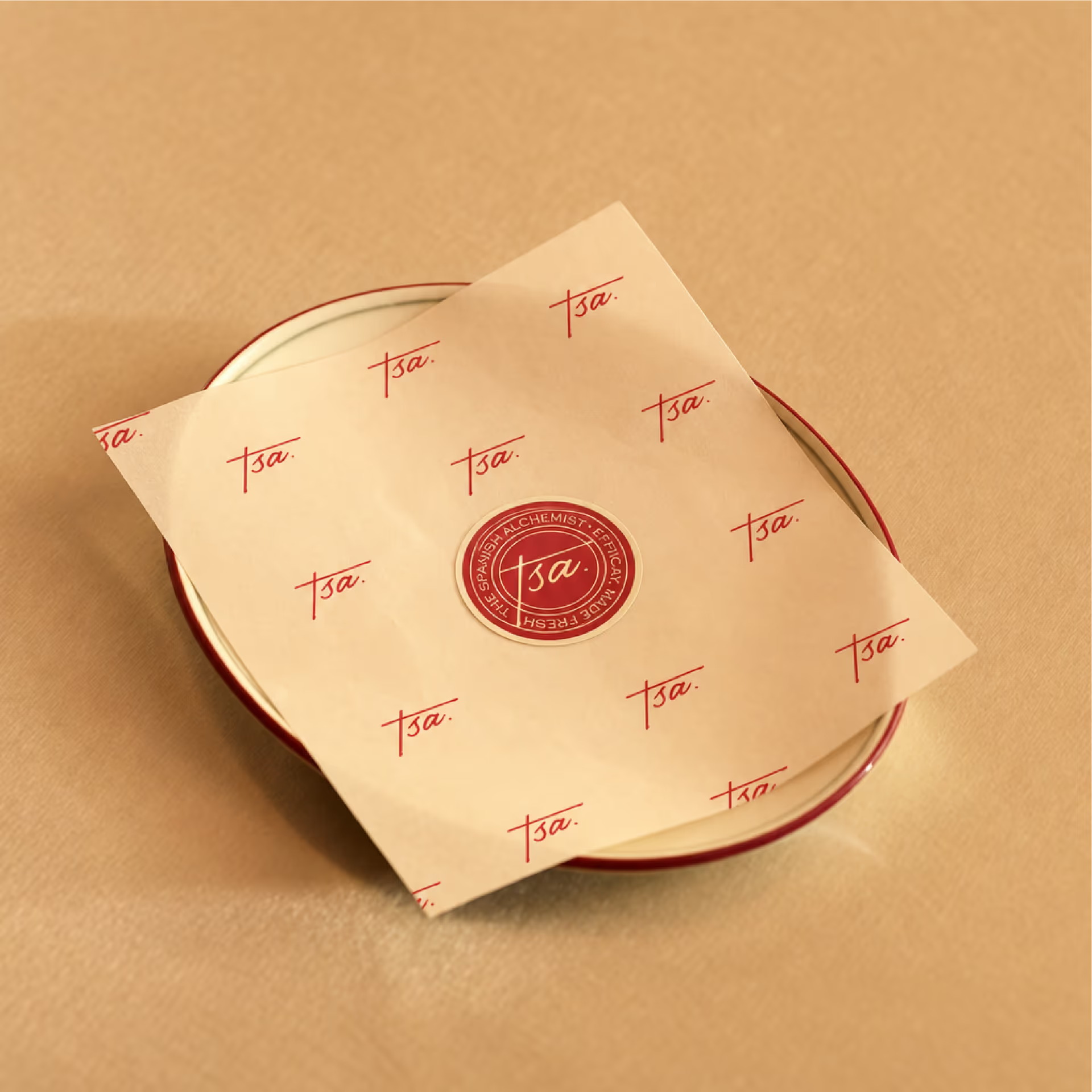
We created a flexible identity system with three key layers: the full The Spanish Alchemist logo, the shorter TSA signature, and the circular TSA seal. Each had a specific role.
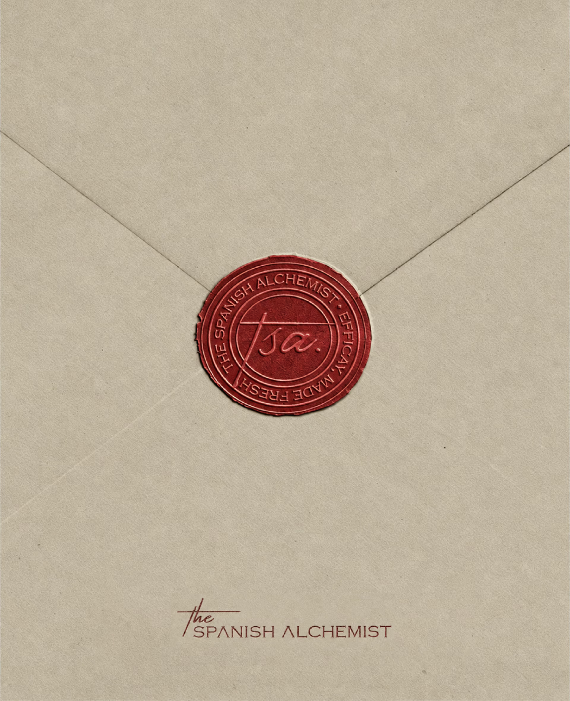
The seal
like a freshness stamp, a mark of trust,
approval, and authenticity.
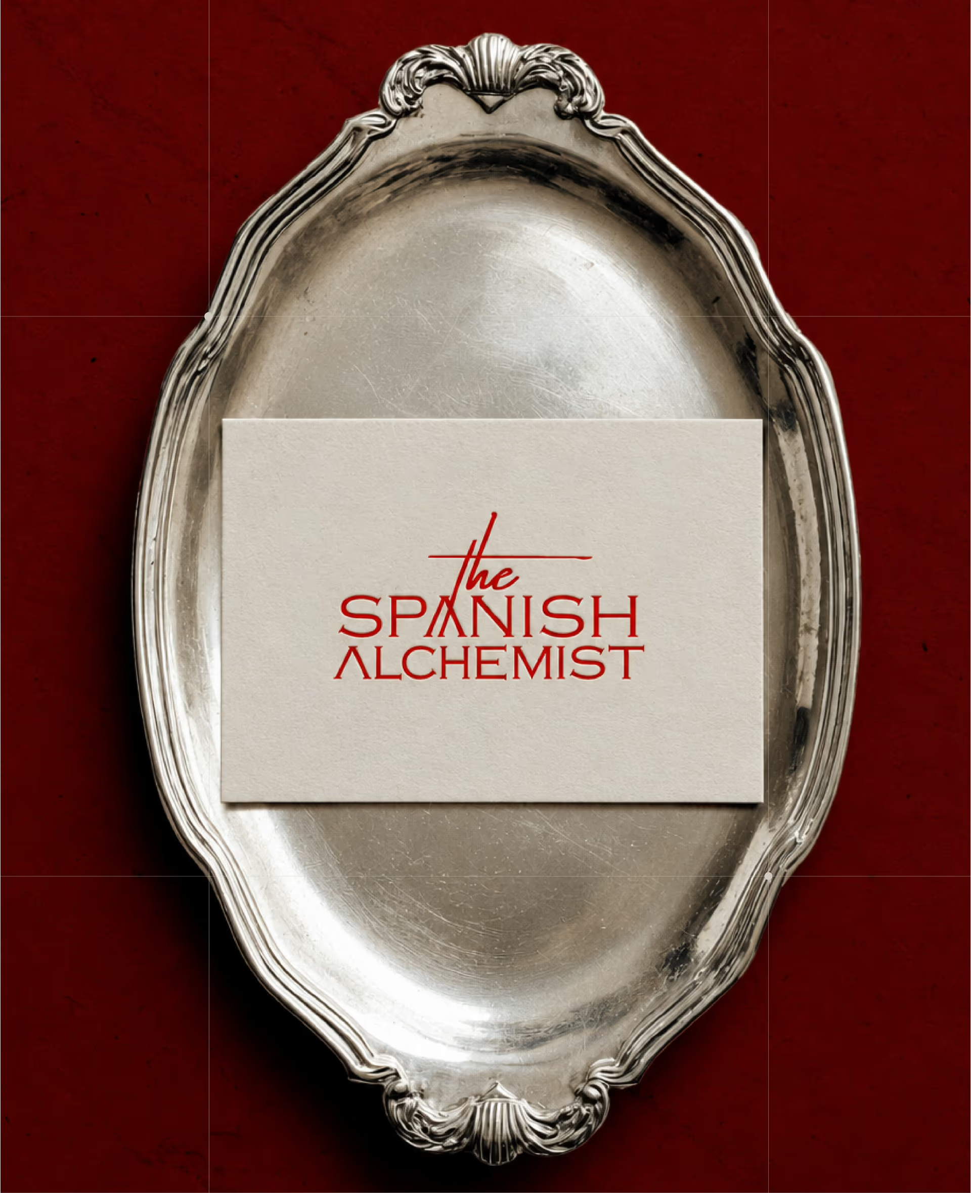
The full logo
created brand presence.
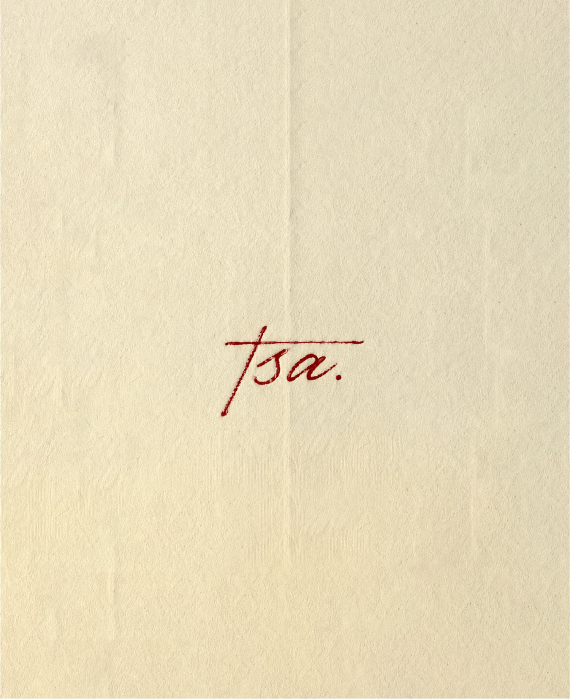
The TSA signature
worked across smaller moments.
Instead of creating a purely corporate skincare logo, we developed a handcrafted signature-style mark. It gave the brand the feeling of a real presence behind the product: the Alchemist, someone involved in the making, testing, and care behind each formulation. This thinking extended into the packaging language as well.
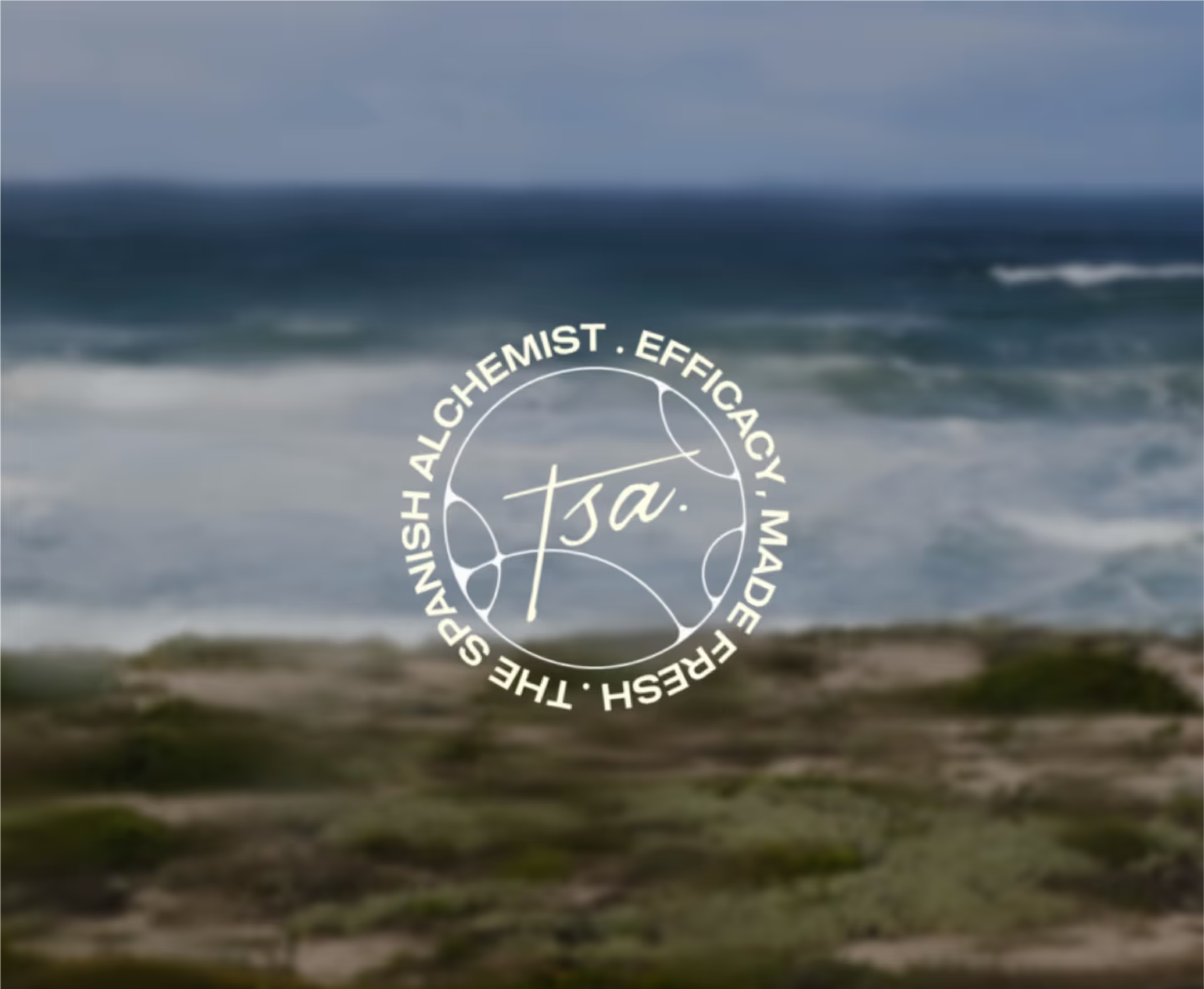
The seal
The signature mark
Making “made fresh”
visible.
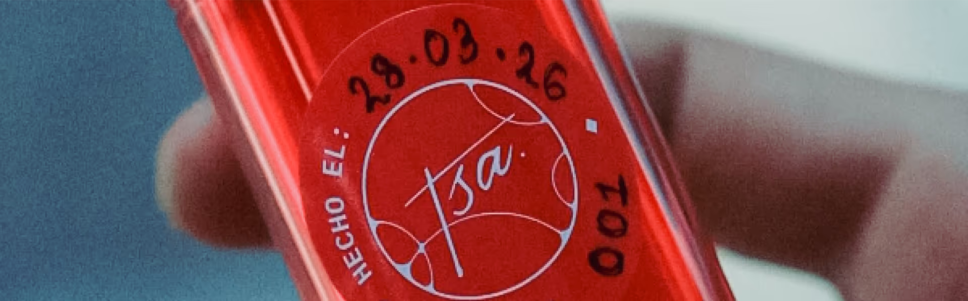
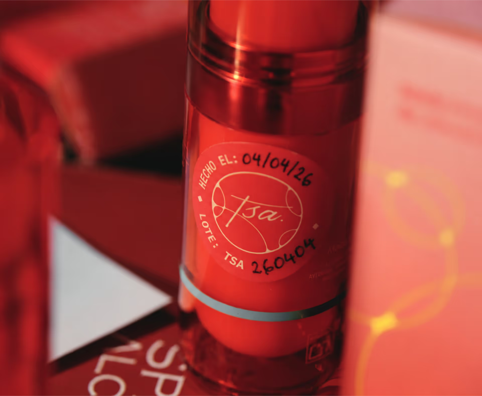
In skincare, freshness is usually hidden inside production cycles, batch records, and expiry dates. For TSA, we brought those details forward. Manufacturing dates, batch codes, handwritten freshness labels, and product codes became part of the brand story and the customer experience rather than being treated as boring mandatory information.
- Manufacturing Dates[ 01 ]
- Batch Codes[ 02 ]
- Handwritten Freshness Labels[ 03 ]
- Product Codes[ 04 ]
Made Fresh Just For You
Lines like “Made Fresh Just For You” became a simple expression of this world.
Together, these details made the brand’s freshness process more visible to the customer. The freshness, timing, and care behind each product were made visible through a language of dates, codes, and labels. The narrative, proof points, and visual language helped make the fresh manufacturing concept clearly felt.
Making the product
instantly recognisable.
The red bottle, the code, and the shelf memory.
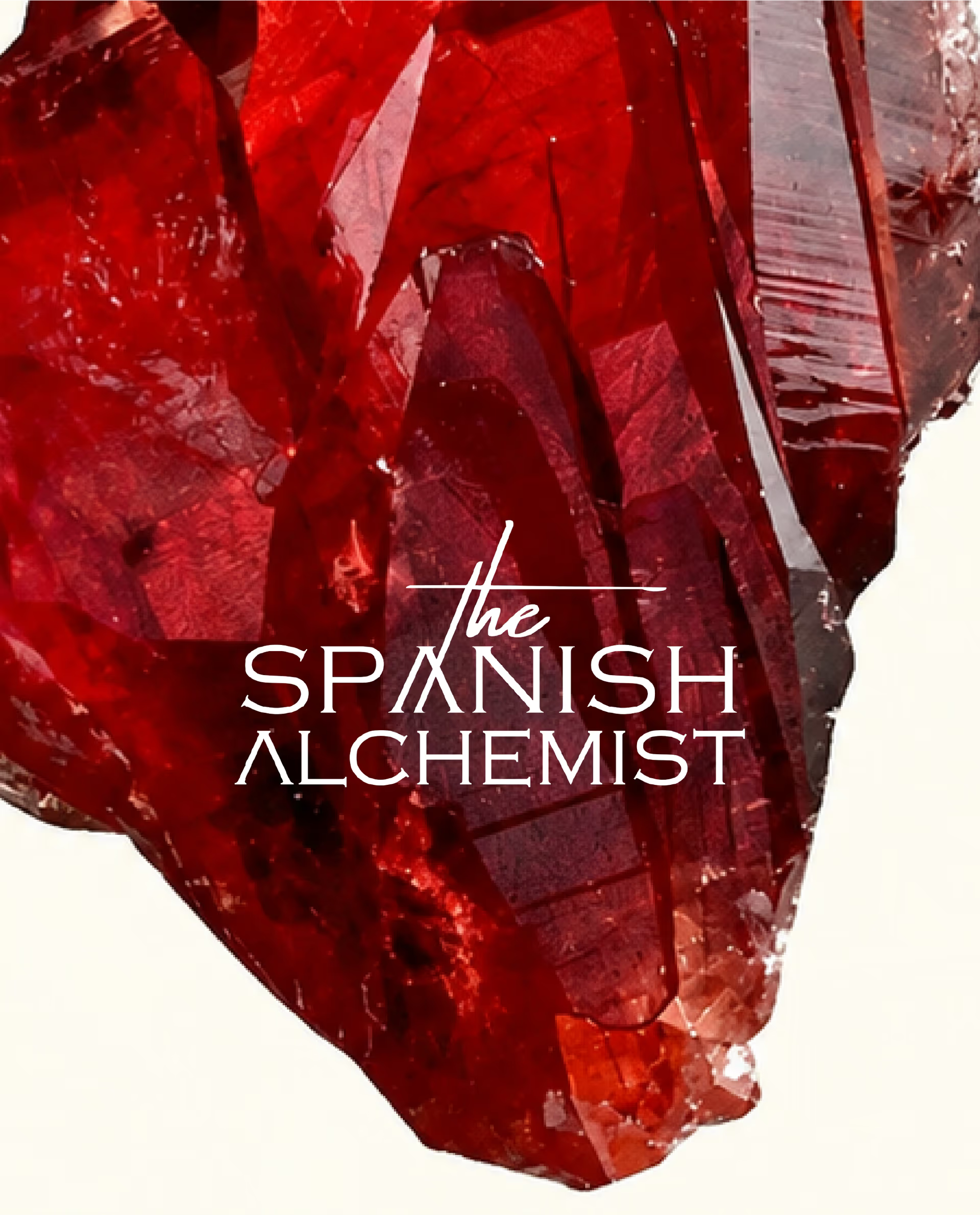
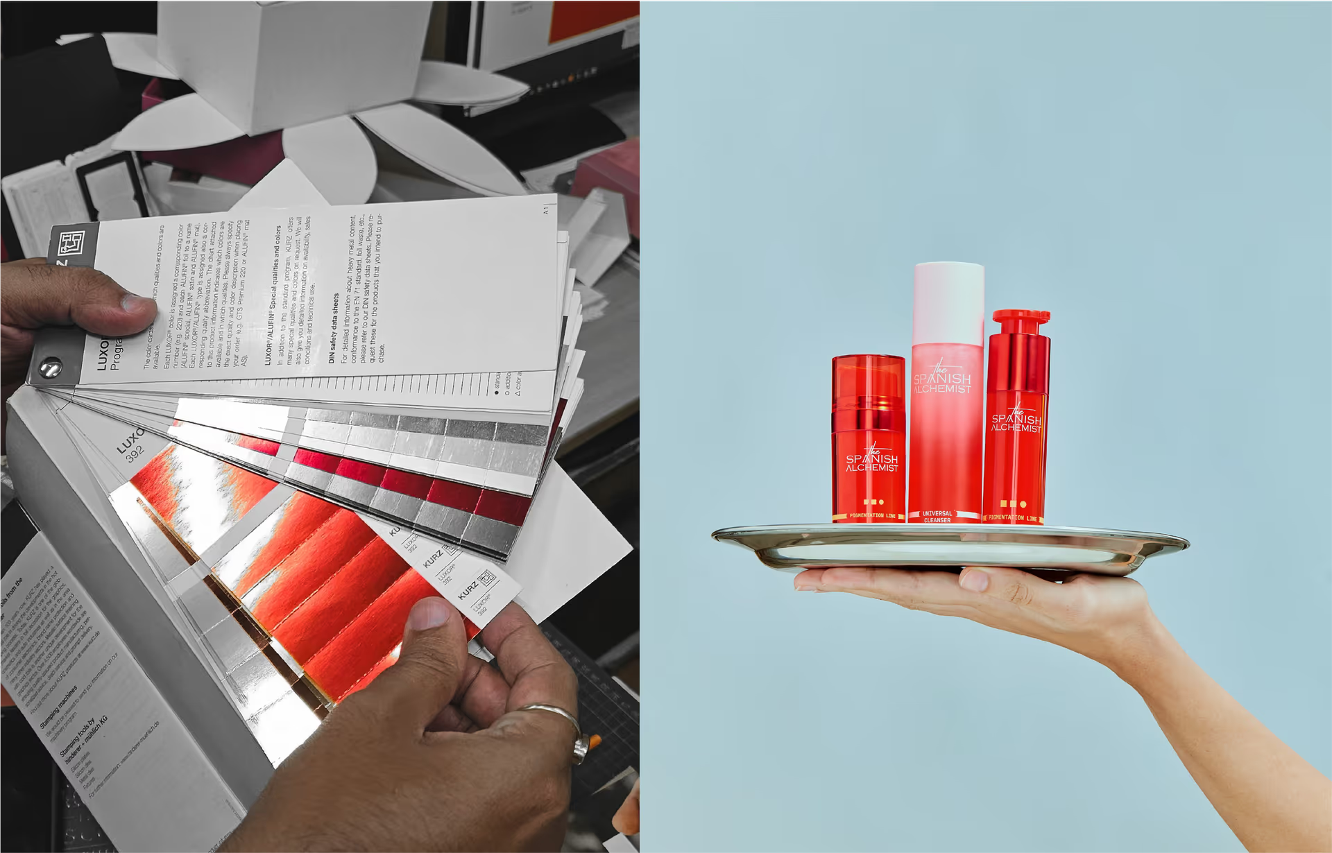
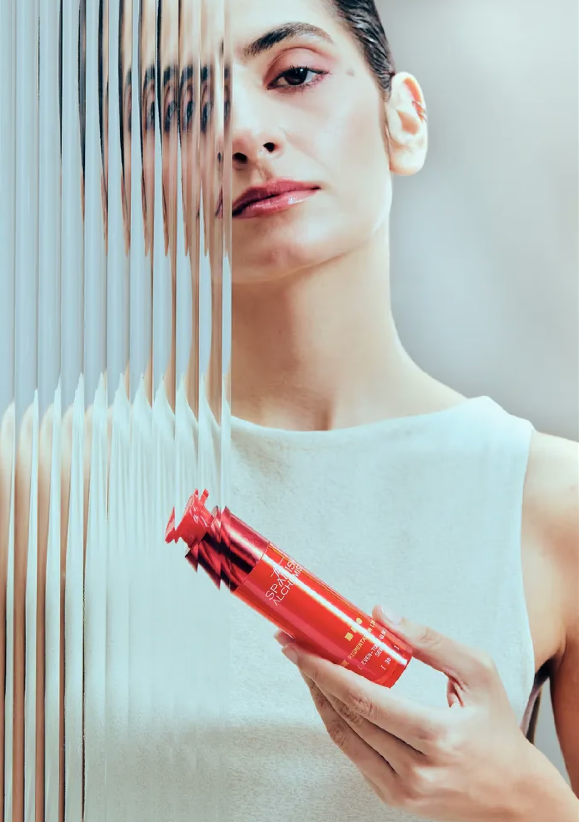
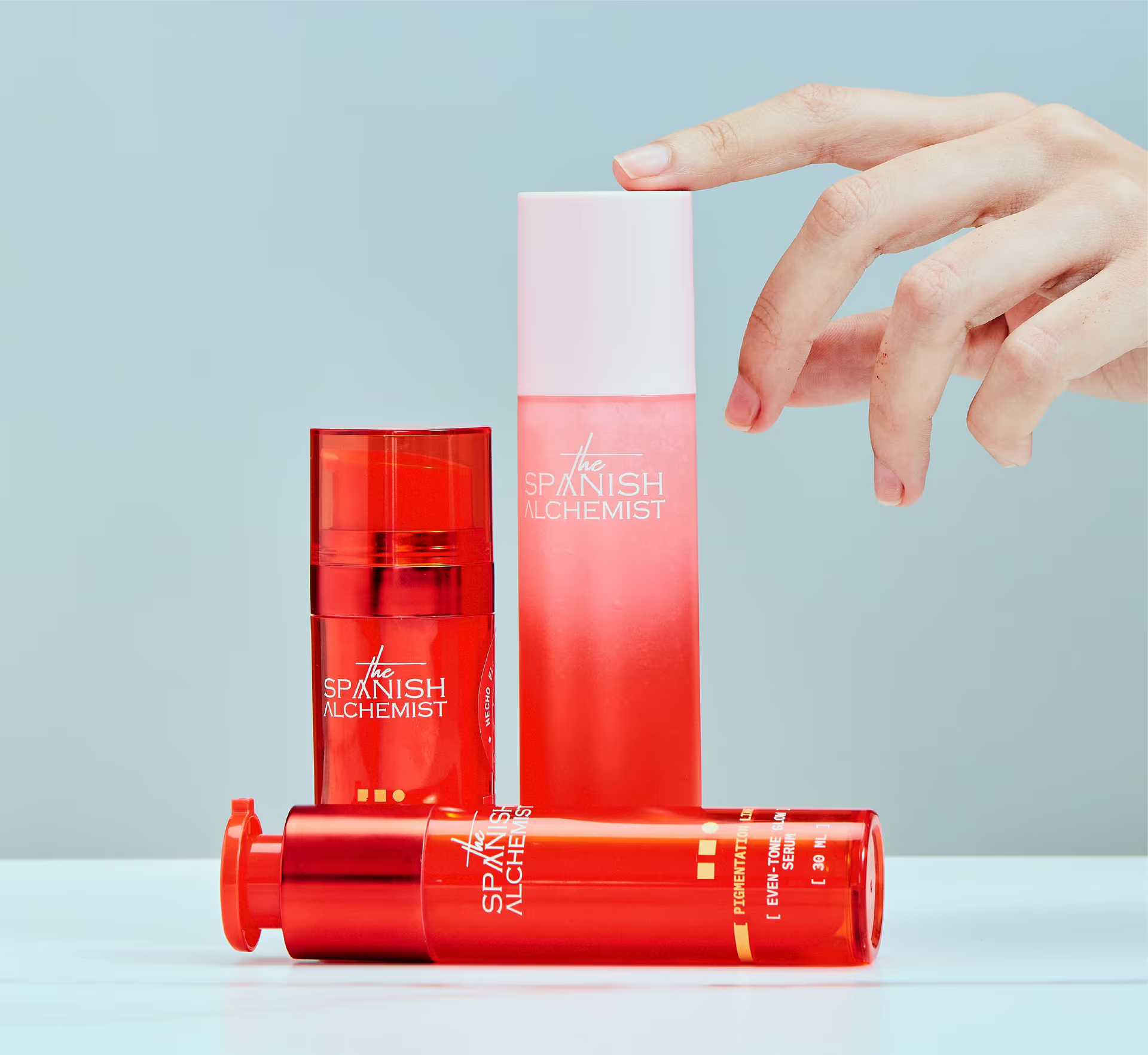
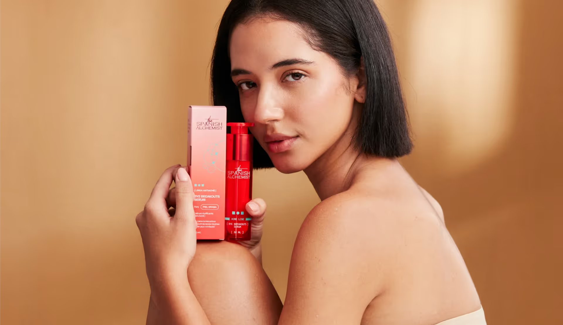
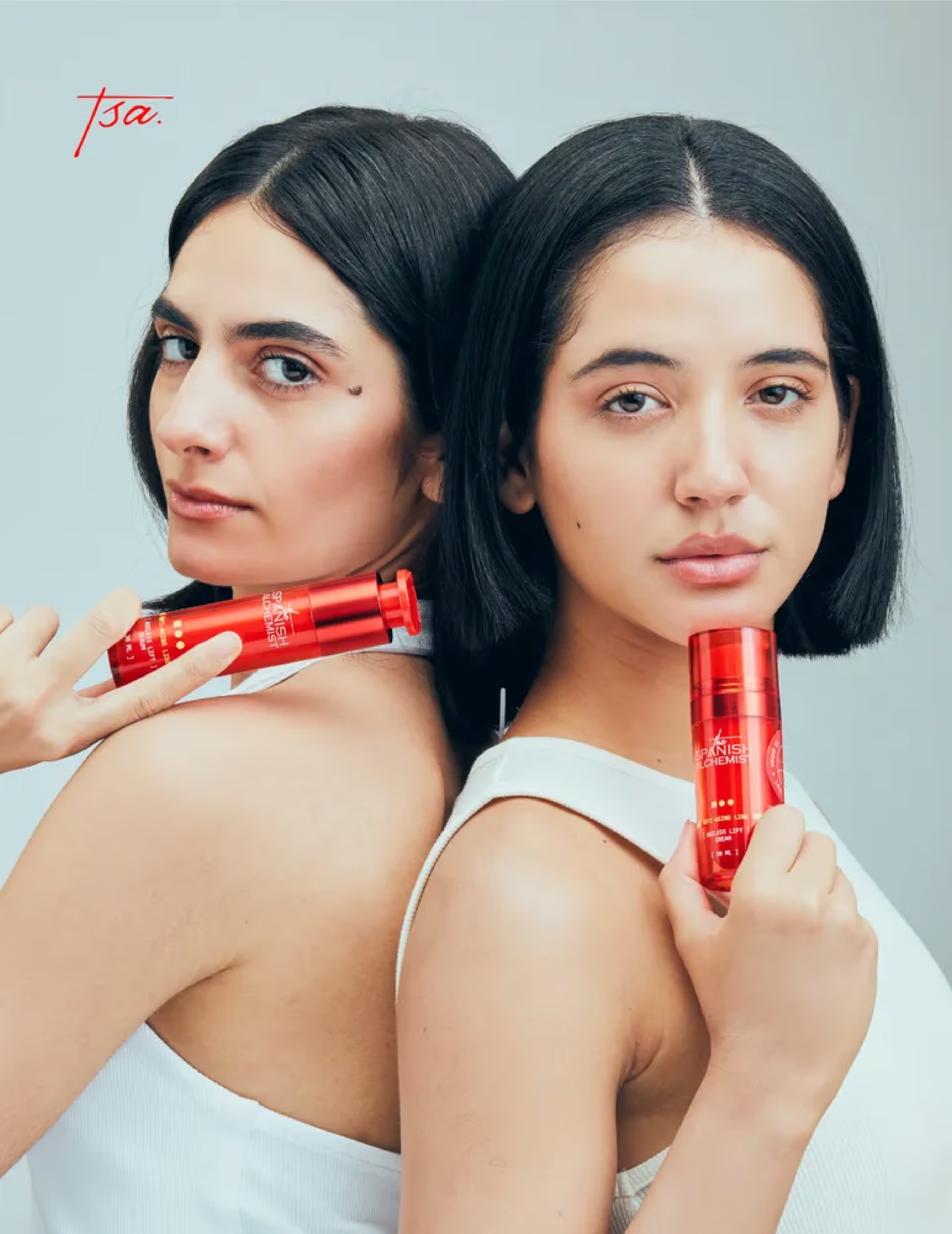
One of the strongest visual decisions was the translucent red bottle that extended the alchemist world into the product itself. Its colour drew from the idea of the Philosopher’s Stone, reflecting subtle cues of intensity, transformation, and potency. It made the product feel active, alive, and instantly recognisable.
However, the product line also needed clear navigation, helping customers understand the range while keeping the brand visually unified. So instead of changing the entire bottle language for every product, we retained the red bottle as the core brand cue and built a smaller coding system through geometric markers, accent colours, line labels, and visual details. This kept each product distinct while keeping the range recognisable, easy to understand, and scalable.
Packaging as the first
conversation.
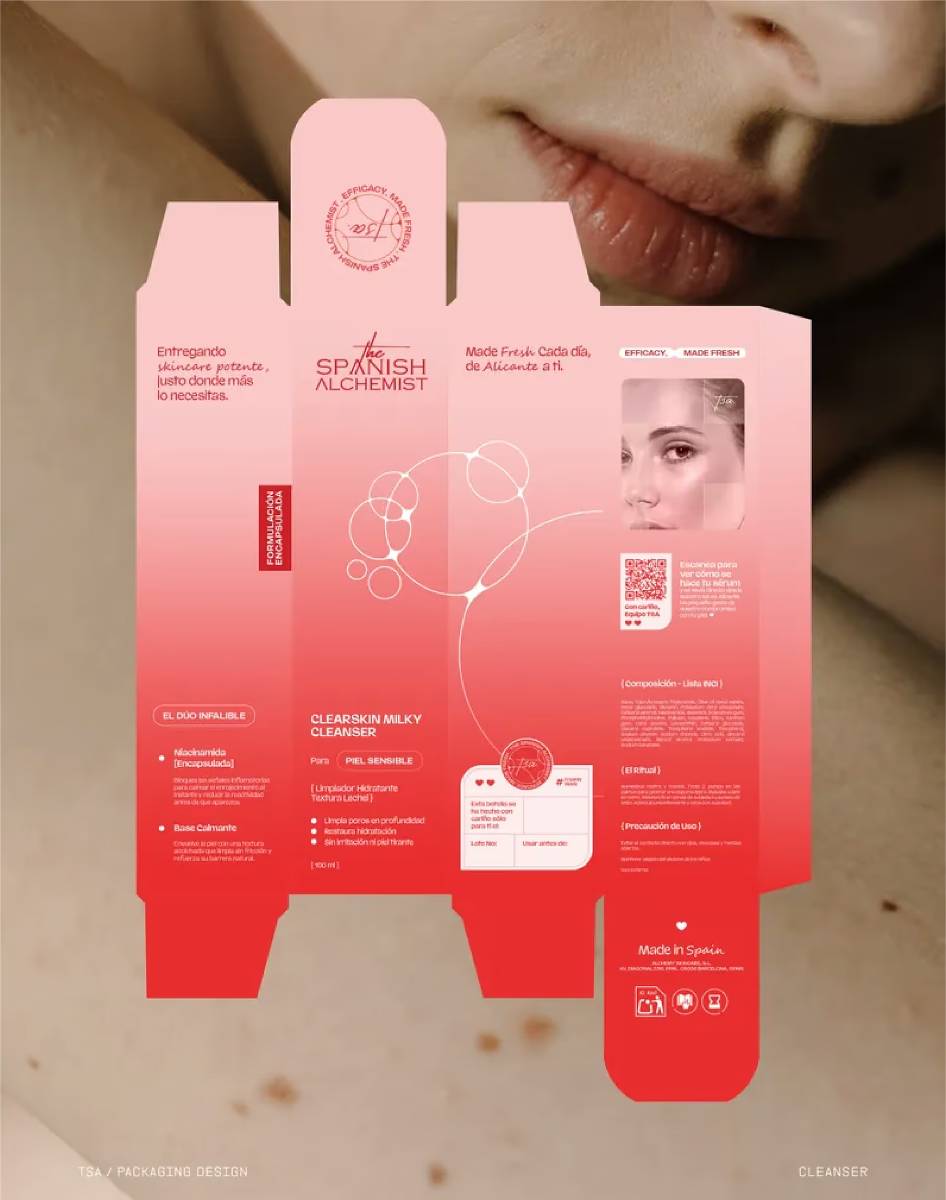
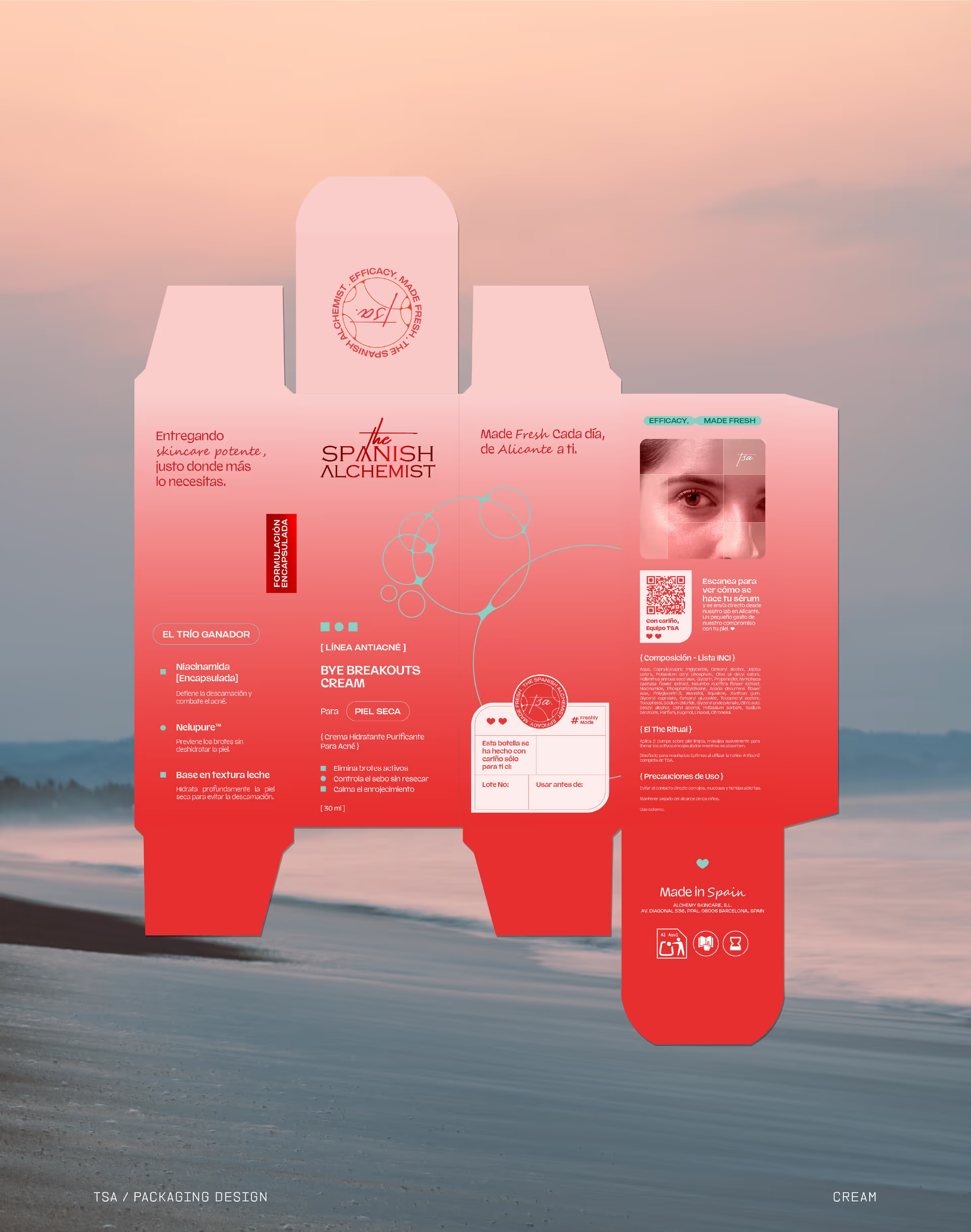
The packaging system was designed as the customer’s first physical conversation with the brand. Each panel had a clear role, from introducing the promise and explaining the formulation to showcasing the product line, skin concerns, ingredients, usage, QR codes, batch details, and a freshness message.
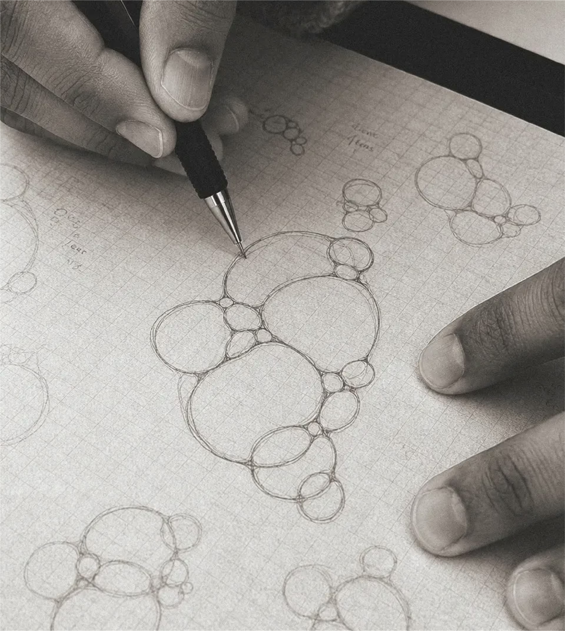
Micro and nano encapsulation technologies also became important visual and communication anchors. They helped bring out the brand’s focus on potency, formulation precision, laboratory testing, and controlled active delivery. We translated this into soft molecular graphics inspired by capsules, cells, bubbles, and active delivery systems. These forms helped the science feel understandable without making the brand feel clinical or intimidating.
Small details like structured typography, handwritten labels, seals, product codes, molecular graphics, batch information, and lab-inspired layouts played an important role too. Together, they made the brand feel precise, personal, credible, and considered.
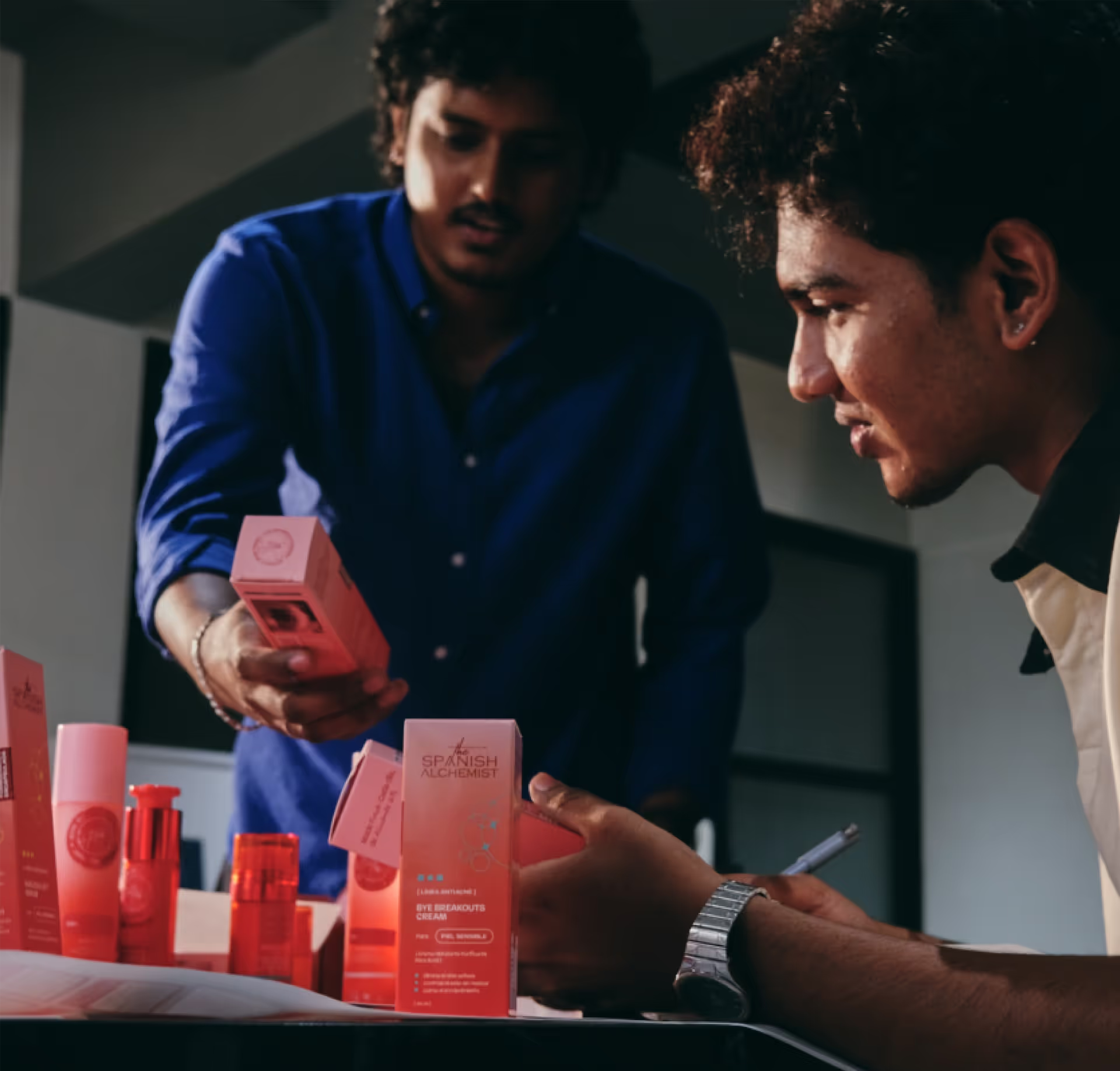
The Sensory Layer of the Brand
Material direction shaped how TSA felt across both physical and digital touchpoints.
Glass, texture, depth, light, and subtle sensory cues informed the bottle, packaging, website, social content, and digital assets. The same feeling of tactility was carried from the product in hand to the way it appeared on screen. This helped the brand feel consistent across every interaction.
Extending TSA
beyond packaging.
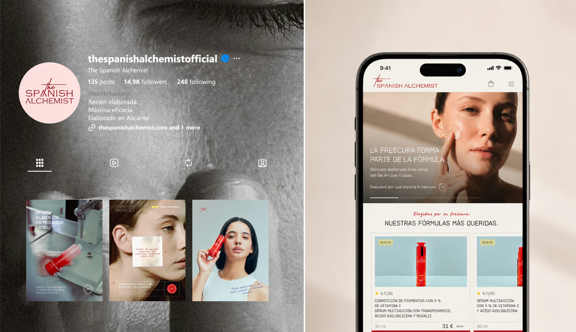
We extended the same system into a successful e-commerce website, digital assets, social media design, email marketing, and content direction. The red bottle, TSA seal, lab-inspired typography, square brackets, handwritten labels, product codes, molecular graphics, playful print pieces, and Spanish cues became repeated memory markers across every platform.
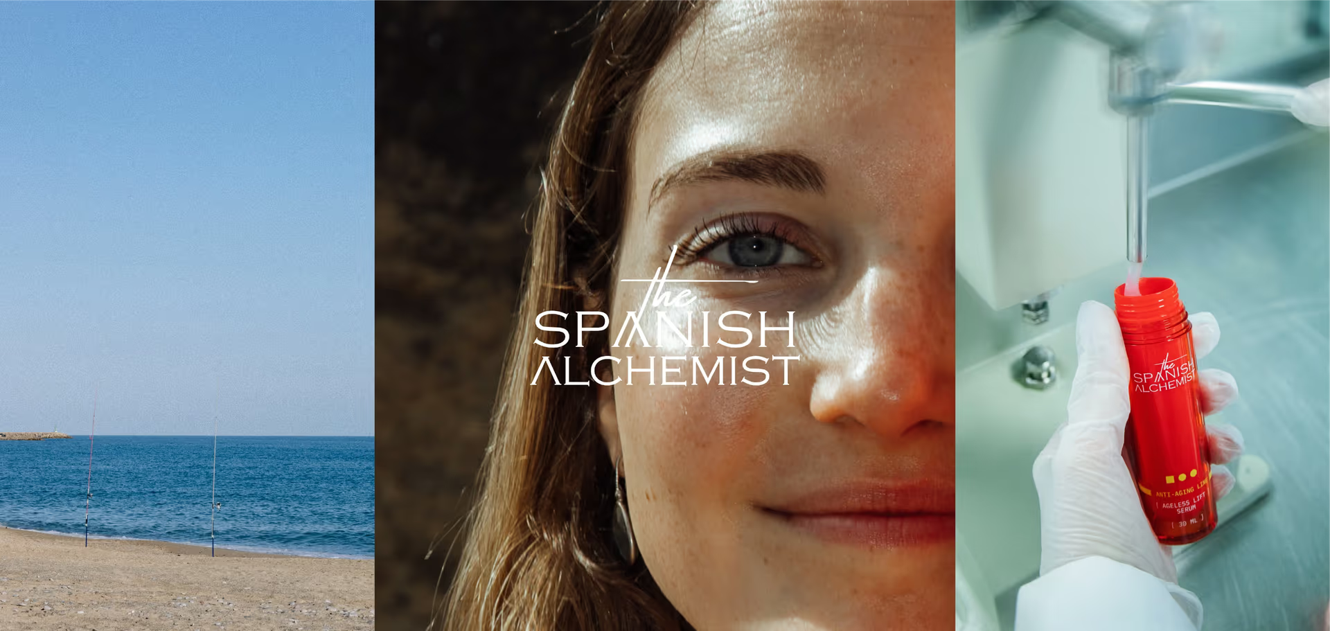
On social media, freshness was also communicated and shown through culture, lifestyle, science, and everyday freshness cues: flowers, bread, apples, sea, sunlight, skin, laboratory details, and the atmosphere of Alicante. This gave the brand more room to speak. TSA could talk about skincare but also about time, preparation, freshness, routine, and care without sounding repetitive.
Building a complete brand
ecosystem.
The Spanish Alchemist started as a fresh skincare concept.
It became a complete brand system built across name, identity, packaging, website, content, social media, email, and customer experience.
Together, these choices helped TSA enter the market with a clear identity, a distinct visual presence, a strong product language, and a brand experience that made freshness feel visible, personal, and easy to trust.
The work has also continued beyond the initial launch system. As the brand grows, we continue to support TSA across content, campaigns, digital communication, lead-generation, and new customer experiences, strengthening the brand’s presence across different touchpoints.
What has been built so far is a living brand ecosystem; it is a foundation that keeps expanding with the brand, shaped by new ideas, market responses, and the opportunities that continue to emerge.
Reflections
The Spanish Alchemist became an exploration into freshness, sensory experience, intentional consumption, and the relationship between science and ritual, rather than just a skincare identity.
For us, the project represented the kind of work we are most drawn to, where branding becomes a way of shaping not just perception, but philosophy, behavior, and experience.