MedTech Corporation
Giving a clearer visual expression and brand experience to a 45+ year healthcare journey in Qatar.
Branding / Website / Content Strategy / Events / UI/UX / Pitch Decks /Story-driven Narrative Videos / Brand Story Videos /Brand Collaterals / Social Media
Hari (Lead), Archana, Sreejith, Arun Anand, Vibish, Raunak, Abhinav
A legacy looking
for identity.
MedTech Corporation came to the branding process with something many brands spend years trying to build: credibility.
For over 45 years, the company had been part of Qatar’s healthcare sector, growing its expertise, systems, partnerships, alliances, and industry relationships. It was not a company looking for branding to create substance.
The challenge was more interesting:
The substance already existed. Branding had to give it clarity, confidence, and a memorable identity.
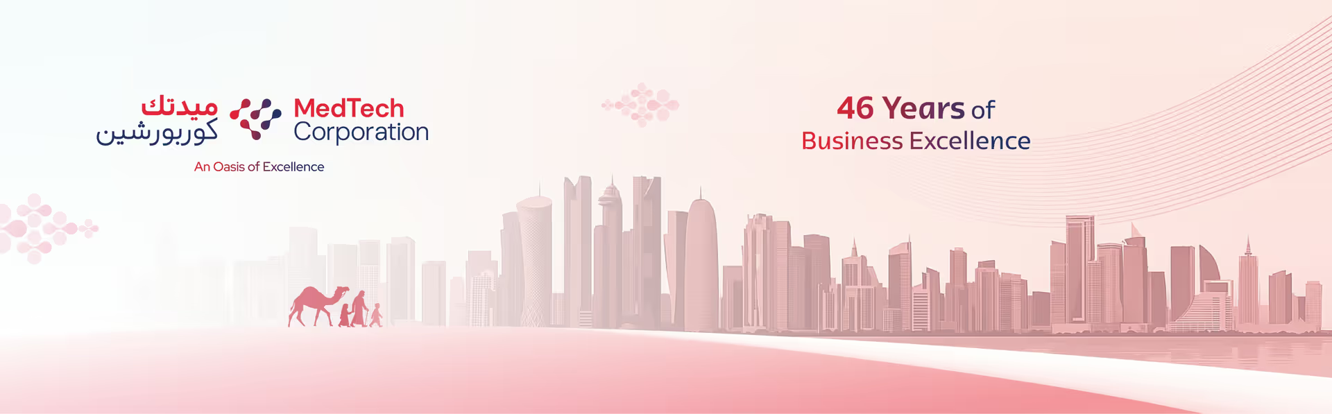
MedTech Corporation is a successful healthcare integrator with deep local roots, strong global partnerships, and a continuing role in Qatar’s healthcare progress. And it needed a clearer way to present the scale of what it had become.
Our work was shaped around that distinction.
For a company with this kind of legacy, the challenge was not simply visual freshness. It was about finding a language large enough to carry its journey: the founder’s vision, the organisation’s growth, its role in Qatar’s healthcare landscape, its global partnerships, and the human value behind its work.
Its legacy, leadership, services, partnerships, profiles, events, digital presence, and ongoing communication needed to feel like they belonged to one connected world.
Making credibility
easier to recognise
Our collaboration with MedTech began in 2025. As the engagement developed, our role became more defined: to help MedTech create a brand identity, develop a brand system, and build a connected brand world that could hold together its history, leadership, people, partners, infrastructure, and future.
The direction was to create a brand language that could feel institutional and human at the same time. It had to carry the confidence of a healthcare company working with large systems, hospitals, technologies, logistics, partnerships, and international alliances. But it also had to return that scale to people, care, community, progress, and lived experience.
That balance became central to the creative direction.
Precise enough to feel credible, warm enough to feel human, and rooted enough to feel distinctly connected to Qatar.Precise enough to feel credible,
warm enough to feel human, and rooted enough
to feel distinctly connected to Qatar.
A visual language drawn
from within the brand
The creative direction began by looking beyond conventional healthcare imagery.
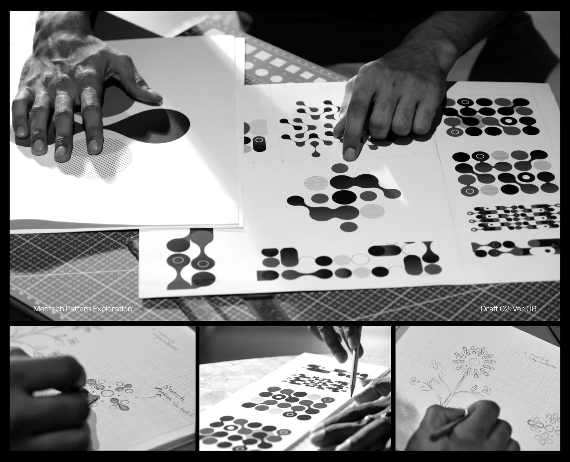
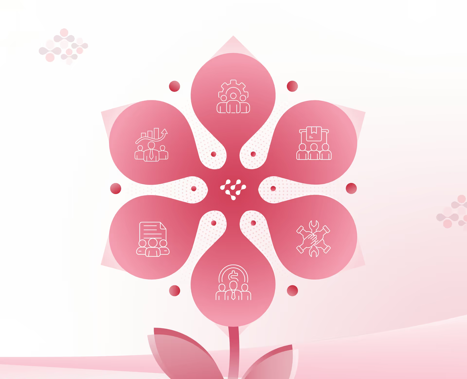
The existing logo was not treated as a static mark to be placed on every surface. The geometric patterns in the logo represented a blood drop, a heart, a DNA strand, and cell division, which became a source for a wider visual language.
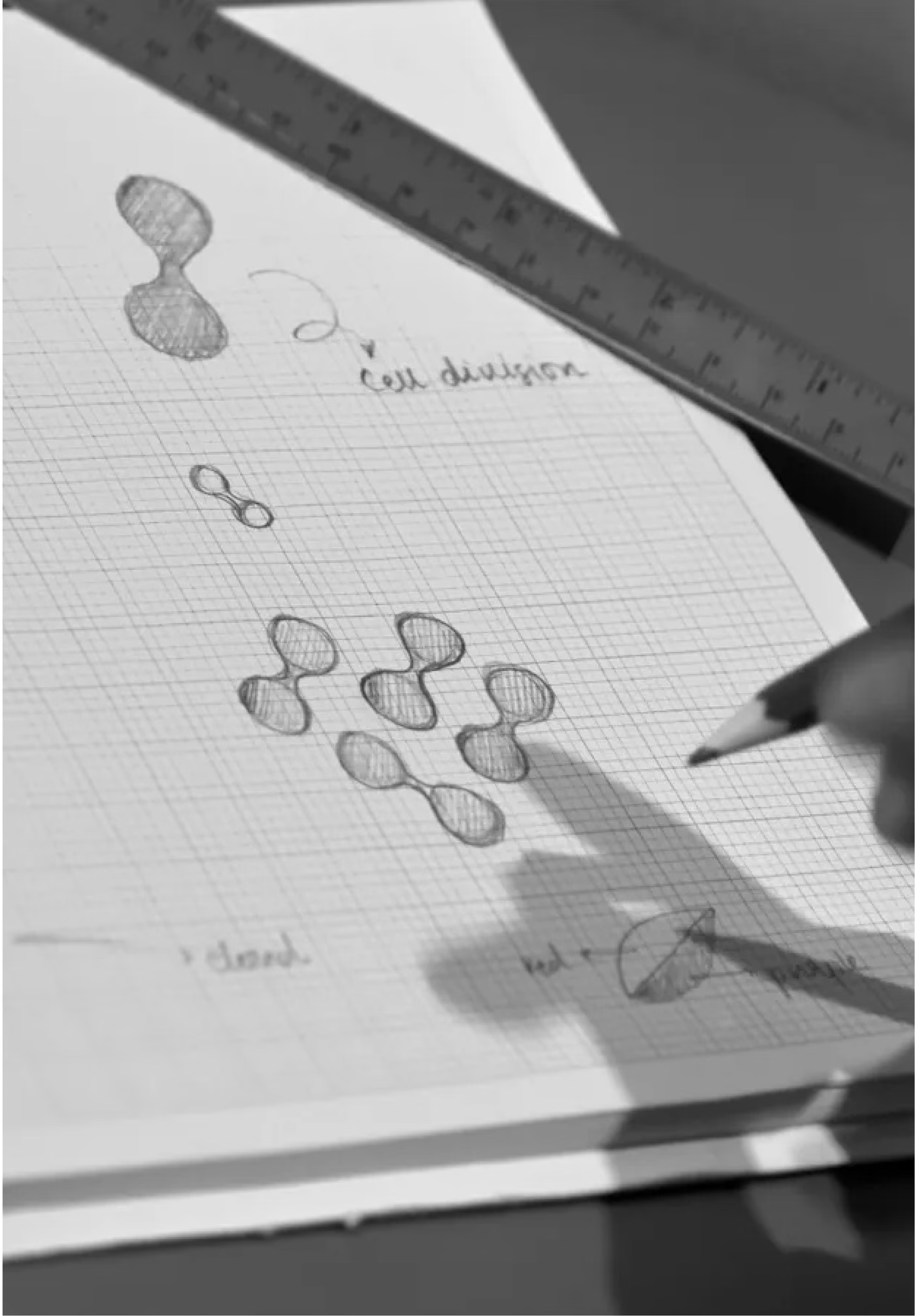
From it came forms that could suggest droplets, cells, flowers, people, networks, links, canopies, and radial systems. This gave MedTech a visual world that could move between healthcare, people, and infrastructure.
The system allowed the brand to stay recognisable without forcing every application to look the same. It could be formal in a business card, expansive in a company profile, atmospheric in a video, structured in a presentation, and spatial in an event environment. That flexibility became essential because MedTech’s communication does not live in one format. It moves across boardrooms, exhibitions, conferences, digital platforms, corporate documents, cultural communication, and industry engagements.
The visual identity had to be disciplined enough for a healthcare corporation, but alive enough to carry a story.
When a healthcare
brand becomes
a journey
As the narrative became clearer, the identity system also began to expand.
MedTech could have easily been represented through familiar corporate cues: medical blues, sterile spaces, product photography, technology grids, and abstract innovation graphics. But that would have flattened the story of a company with deep roots in Qatar.
A major part of the brand narrative came from understanding the parallels between three journeys: the founder’s journey, MedTech’s evolution, and Qatar’s own transformation.
This gave the work a stronger emotional and cultural foundation.
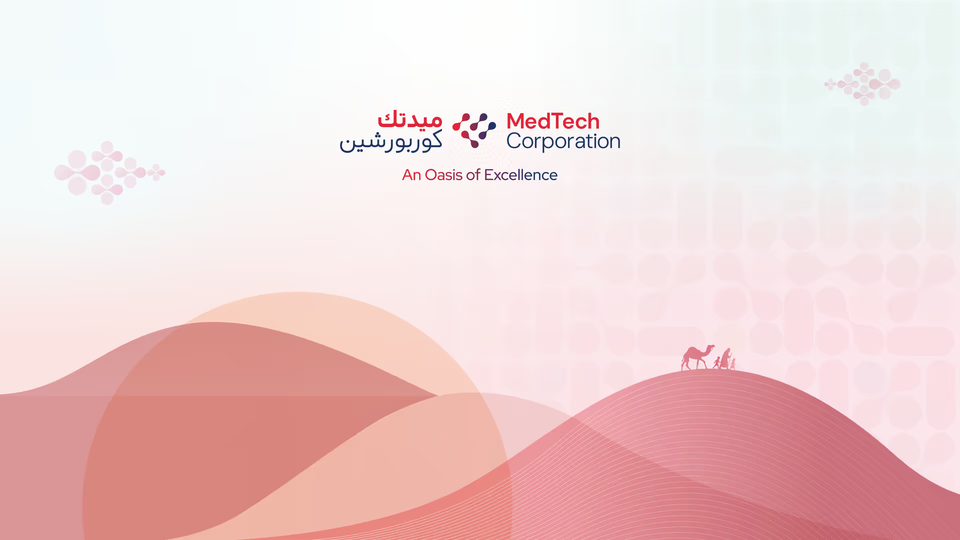
Qatar was not used as a surface-level visual backdrop. Its landscapes, heritage, movement, architecture, and cultural memory became part of how the MedTech story could be told.
The traveller, the small caravan, desert, dunes, camel, oasis, sea, pearls, seed, tree, civilisation, skyline, souq, coast, and changing landscapes were used as symbols of movement, endurance, direction, trust, growth, and belonging.
Together, these references helped MedTech move beyond a conventional corporate healthcare story. The small caravan of a traveller in the desert became the metaphor for the founder, for the company, and for the spirit of progress that has carried MedTech across decades.
The company profile
became the first
wide landscape
The company profile became one of the most important spaces for the brand system to prove itself.
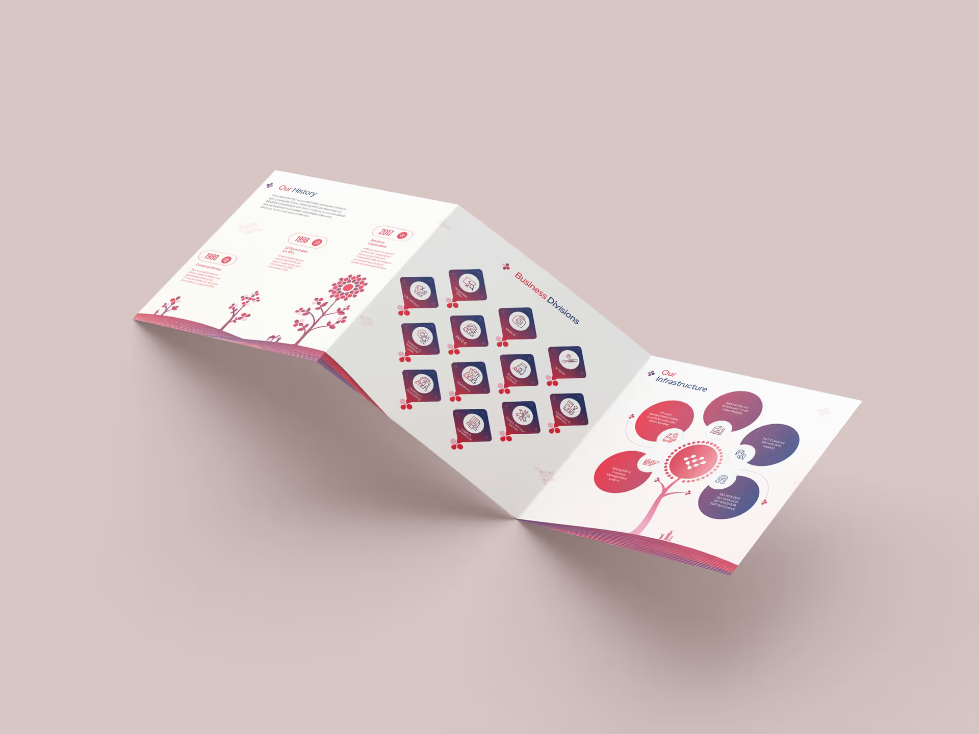
A profile for an organisation like MedTech naturally carries a lot of information: history, leadership, vision, divisions, partners, customers, infrastructure, organisational structure, values, and growth. The challenge was to keep that information clear while making it more memorable.
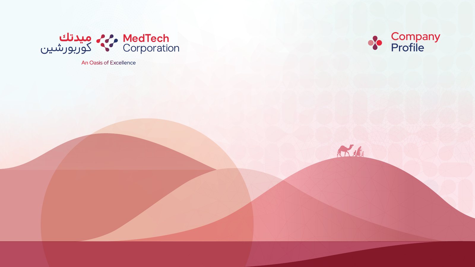
Company Profile
So instead of treating it as a catalogue of facts, we shaped it around the idea of the nomad’s journey in a desert.
- [ 01 ]
History became cultivated growth.
- [ 02 ]
Values became roots.
- [ 03 ]
Leadership became direction.
- [ 04 ]
Partnerships became networks.
- [ 05 ]
Customers became accumulated trust.
- [ 06 ]
Business divisions became guided specialisms.
- [ 07 ]
Infrastructure became a living support system.
- [ 08 ]
Revenue and growth became terrain crossed over time.
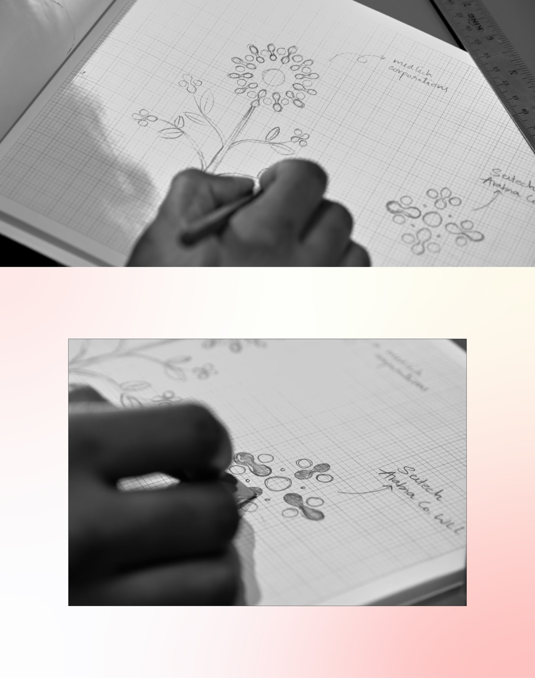
The intention was to make the company profile easier to understand and remember. Every metaphor used was aligned to the content. Typography, hierarchy, spacing, and structure kept the information clear, while the illustrations and symbols gave each section a stronger emotional and visual identity.
Fragments from the process
Behind the final system was a wide field of visual and narrative exploration.
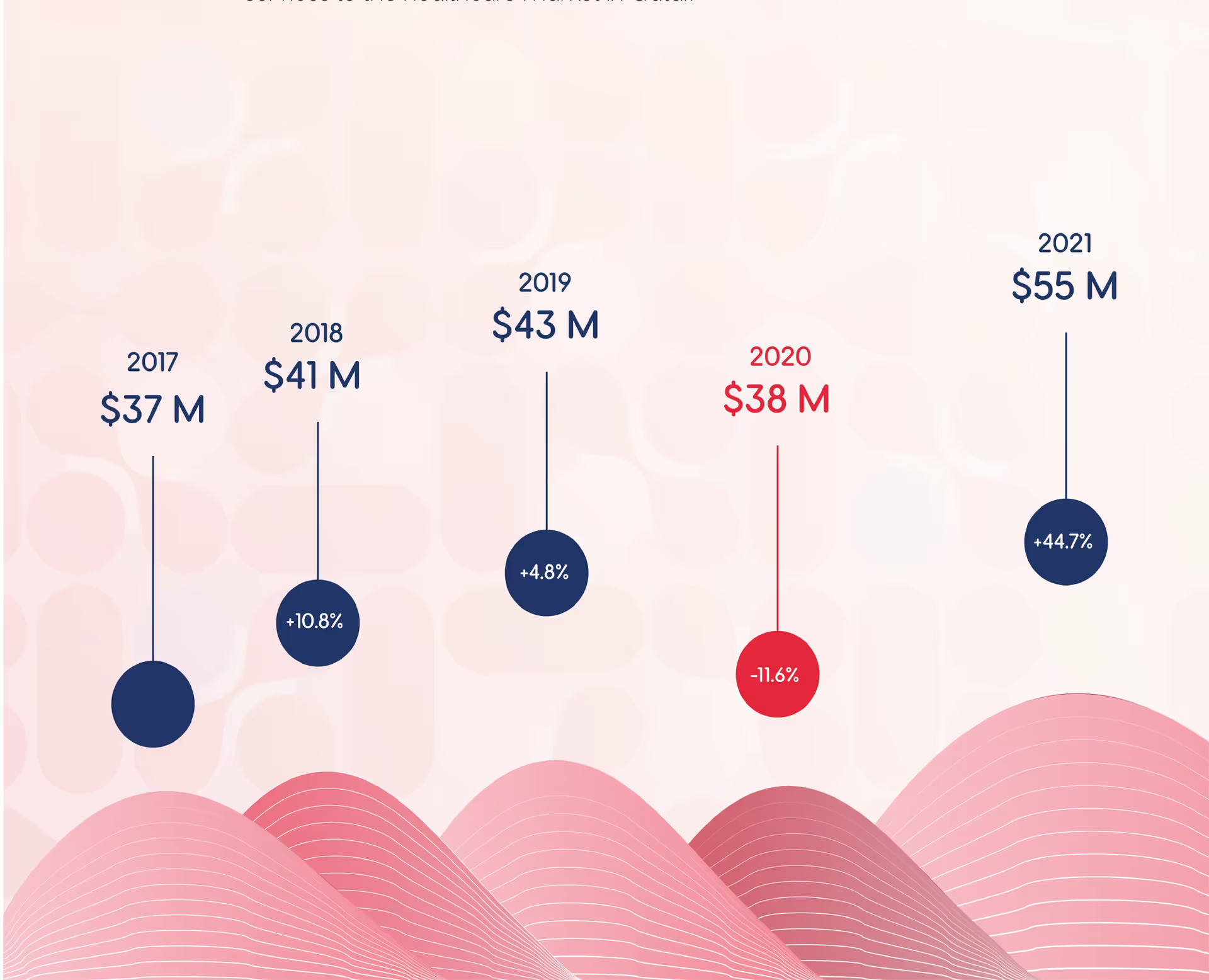
The process involved studying the existing logo, exploring how its shapes could become patterns, symbols, cells, flowers, networks, and intricate systems. It also explored how Qatar’s landscapes could become more than backdrops: how dunes could hold data, how roots could hold values, how architectural marvels could hold partner information, how pearls could hold valuable customers, and how a horizon could carry vision.
The colour direction was shaped to balance authority and warmth. Red, crimson, navy, sand, and pearl white kept the brand connected to healthcare and institutional trust while softening the overall atmosphere.

Typography played a quieter but important role. Since the visual world carried emotion and metaphor, type had to bring order. Clean, geometric, disciplined typography helped keep the system usable across dense corporate information, presentations, brochures, social layouts, and event applications.
The process was not about creating one beautiful visual style. It was about building a system with enough depth to survive many types of communication.
A storytelling video
gave the journey
another life
The brand story video extended this narrative into motion.
Developed in a silhouette-led style inspired by shadow puppetry, the film followed a traveller moving through the desert and changing landscapes. The core narrative of a nomad’s journey through the sea, desert, dunes, oasis, and the metaphorical use of the traveller, camel, a caravan in the desert, emerging civilisation, and the larger journey of adaptation, building, growth, and transformation gave MedTech’s story a visual rhythm.
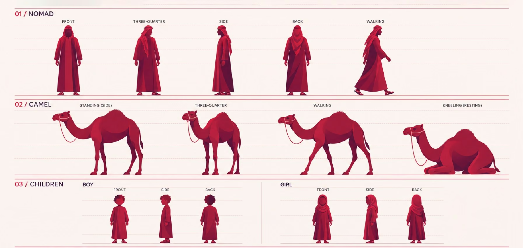
The video helped the company to explain its journey, shaped by endurance, adaptation, and care.The video helped the company to explain its journey,
shaped by endurance, adaptation, and care.
This gave MedTech two complementary modes of communication.
One explained the brand system clearly.
The other allowed the audience to inhabit the brand world emotionally.
Together, they showed how the identity could work both as a rational corporate system and as a story-led visual experience.
Making corporate
communication feel
less distant
One of the most meaningful shifts was in how MedTech’s corporate material began to feel.
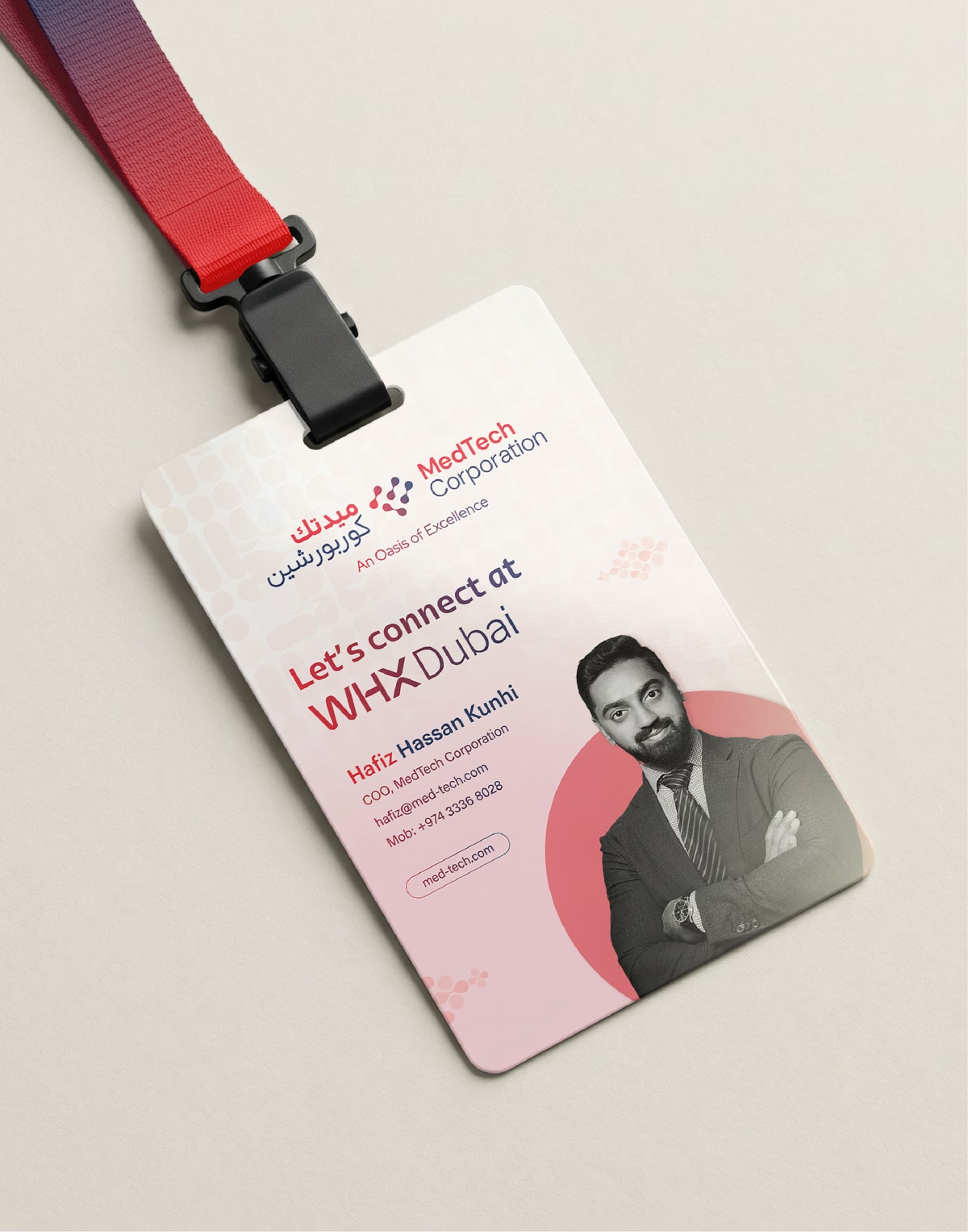
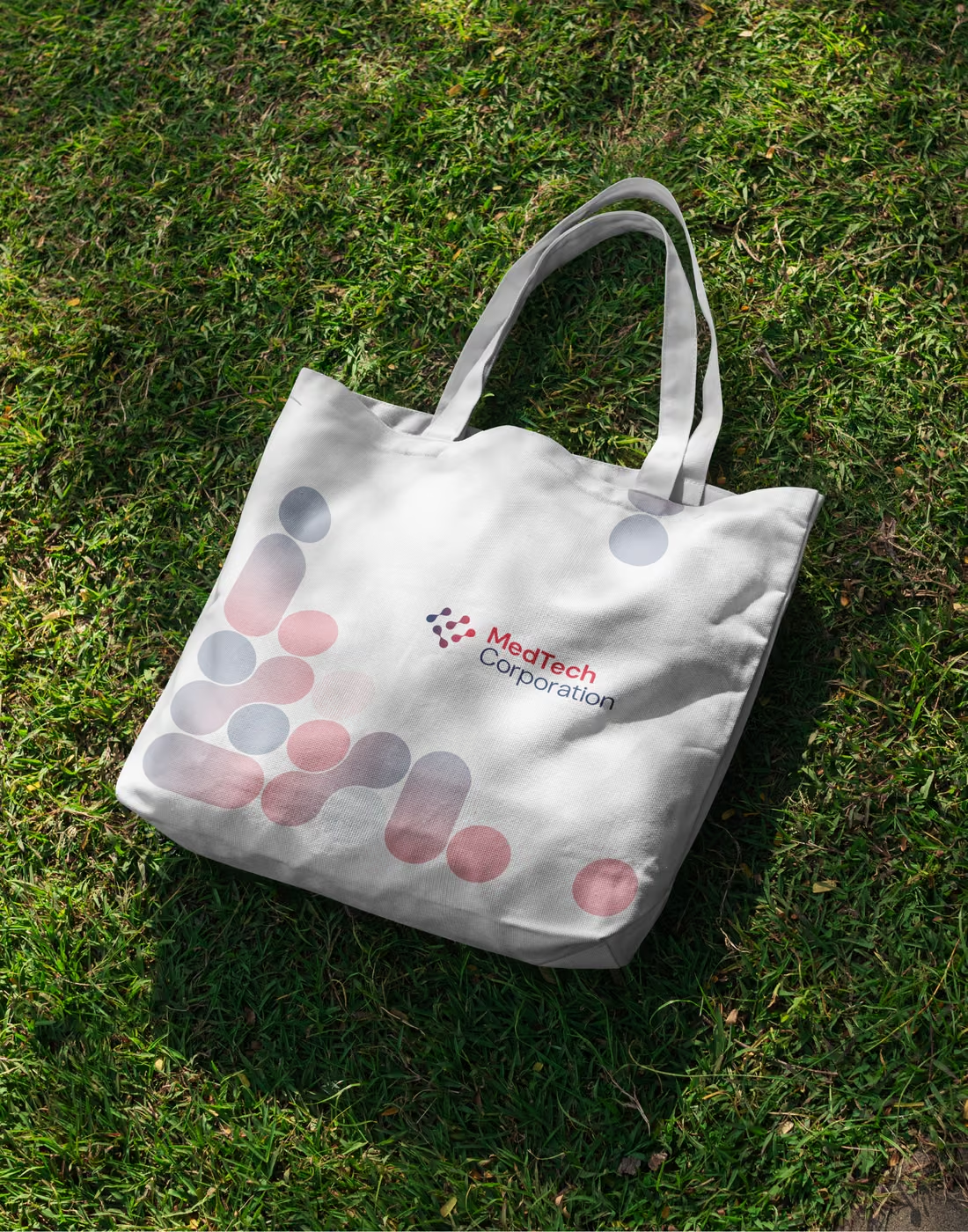
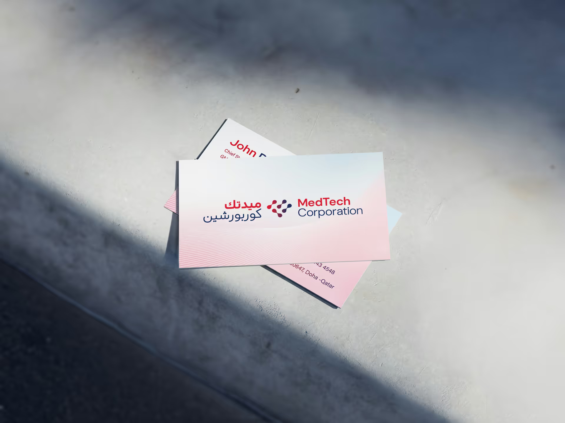
The identity system was extended across a wide range of formal and practical applications. The narrative was carried into brochures, corporate presentations, pitch decks, business cards, ID cards, email signatures, and other communication templates. They made the larger identity system usable inside the organisation and consistent outside it.
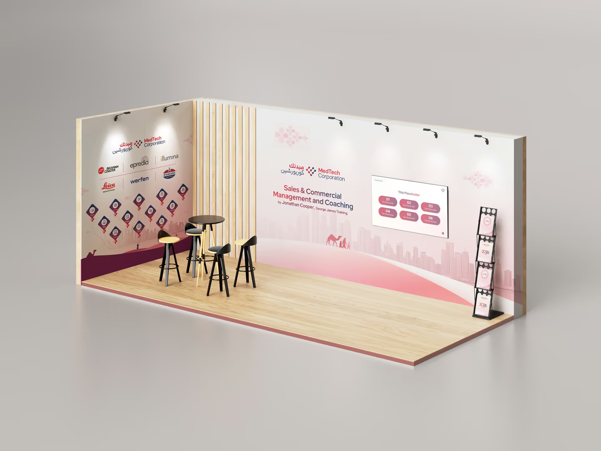
At the same time, MedTech’s event and industry presence required a more spatial and public-facing expression.At the same time, MedTech’s event and industry
presence required a more spatial and public-facing
expression.
- World Health Expo (WHX)
- Conference series
- Workshops
- Industry engagements
- Ramadhan & Suhoor
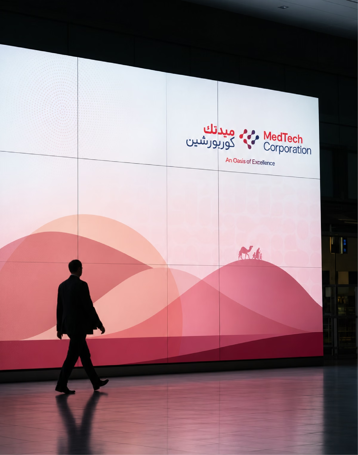
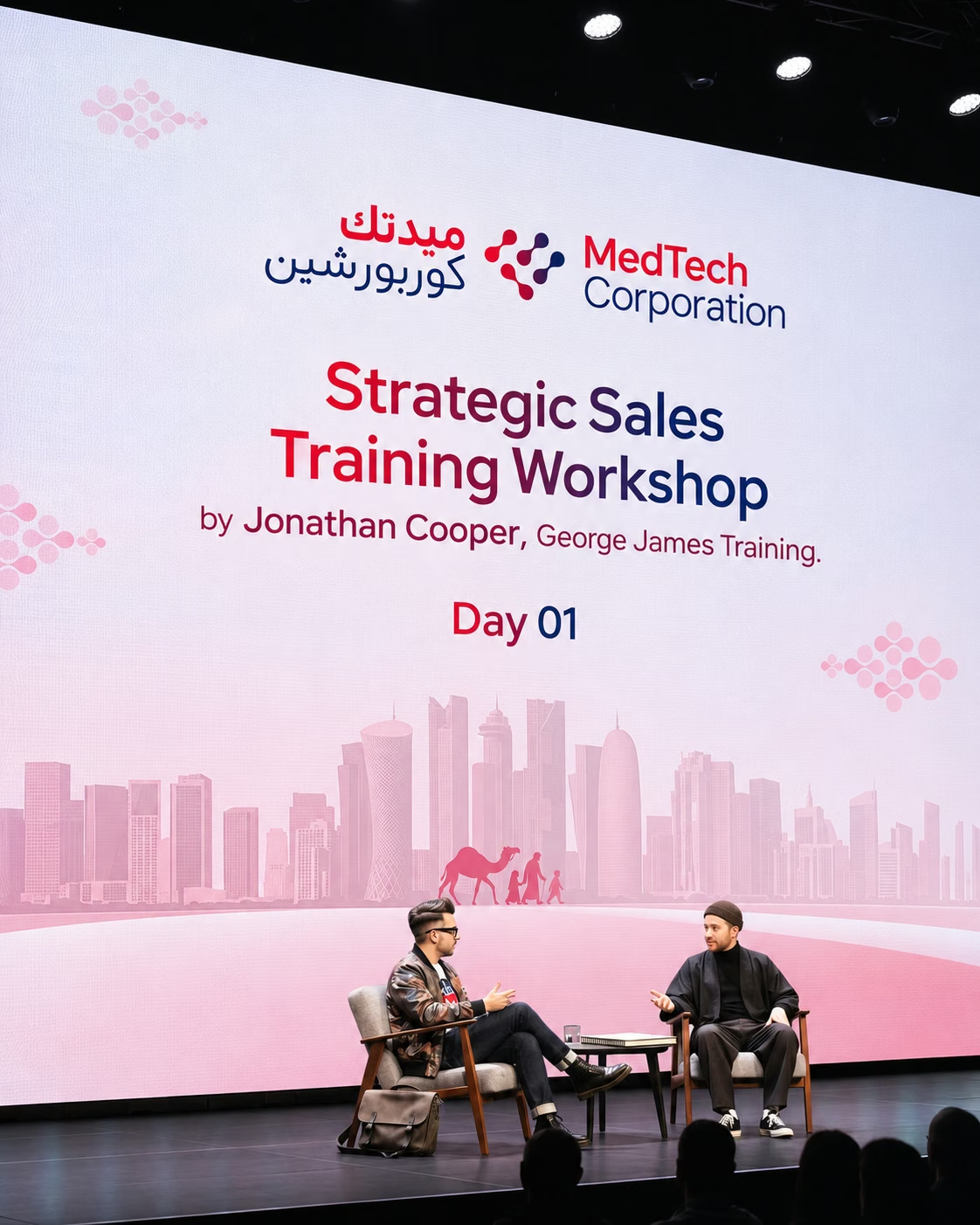
As the narrative got stronger, the brand system was extended into event videos, exhibition communication, branded environments, and partnership communication. It was adapted for major global healthcare exhibitions like the World Health Expo (WHX), other conference series, workshops, conferences, industry engagements, and seasonal cultural gatherings, including Ramadhan and Suhoor.
Everyday
touchpoints,
made consistent
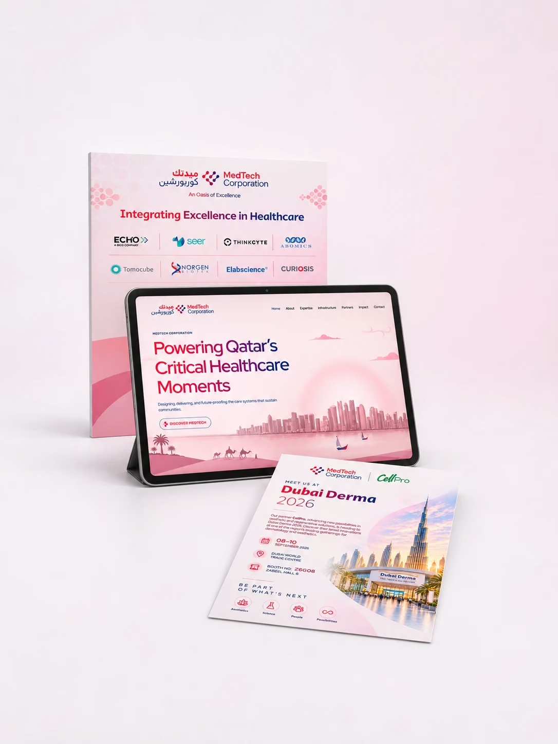
From business cards, ID cards, email signatures, corporate presentations, pitch decks, and communication templates to the website and social media, the brand had to stay consistent across every everyday touchpoint.
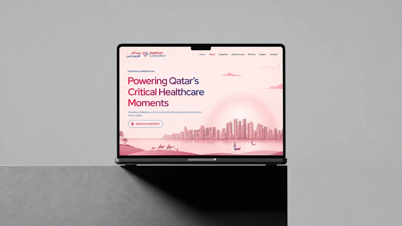
The website became a key space where MedTech’s story, services, partnerships, and vision could come together in one clear digital experience. The journey-led visual language was translated into page layouts, content flow, imagery, hierarchy, and interactive details, helping visitors move through the brand naturally while understanding its legacy and role in Qatar’s healthcare sector. The site was also developed to feel smooth, responsive, fast-loading, and easy to navigate across devices.
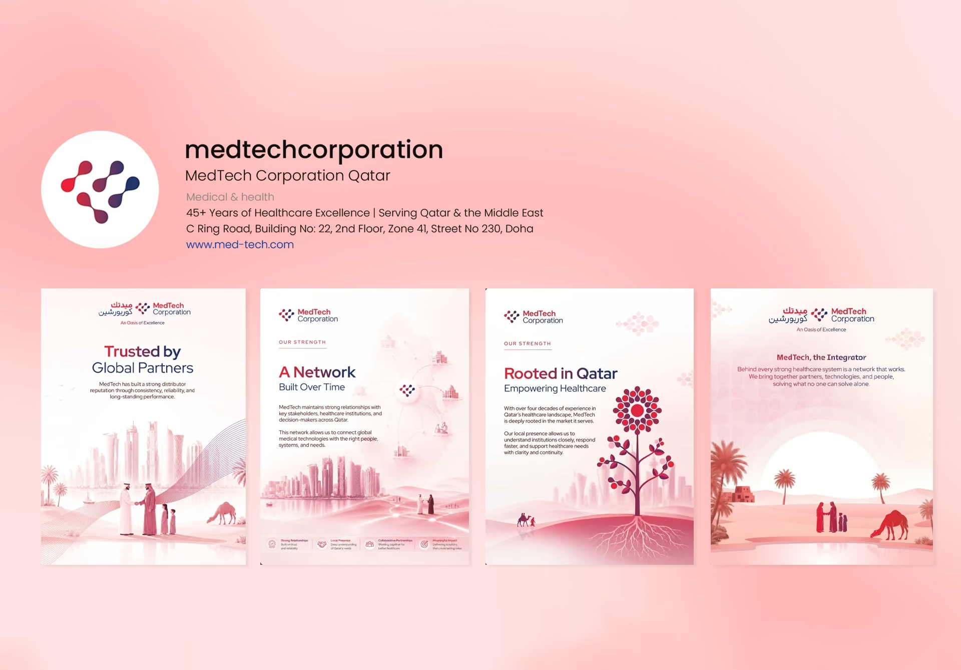
Social media extended the same brand language into a more active and ongoing communication space. Posts, event updates, partnership announcements, healthcare narratives, cultural messages, and campaign-led creatives were designed to feel consistent with the larger identity while remaining flexible enough for everyday communication.
Across digital and physical touchpoints, the goal was to make every interaction feel aligned. Some applications needed only colour, type, hierarchy, and subtle patterning, while others carried more illustration, symbolism, motion, or storytelling. This ability to adjust the intensity of the brand became one of the system’s strongest qualities.

A continuing presence
as a wider cultural
canvas
Over time, MedTech’s brand presence began moving beyond corporate communication into cultural, seasonal, and narrative-led touchpoints.
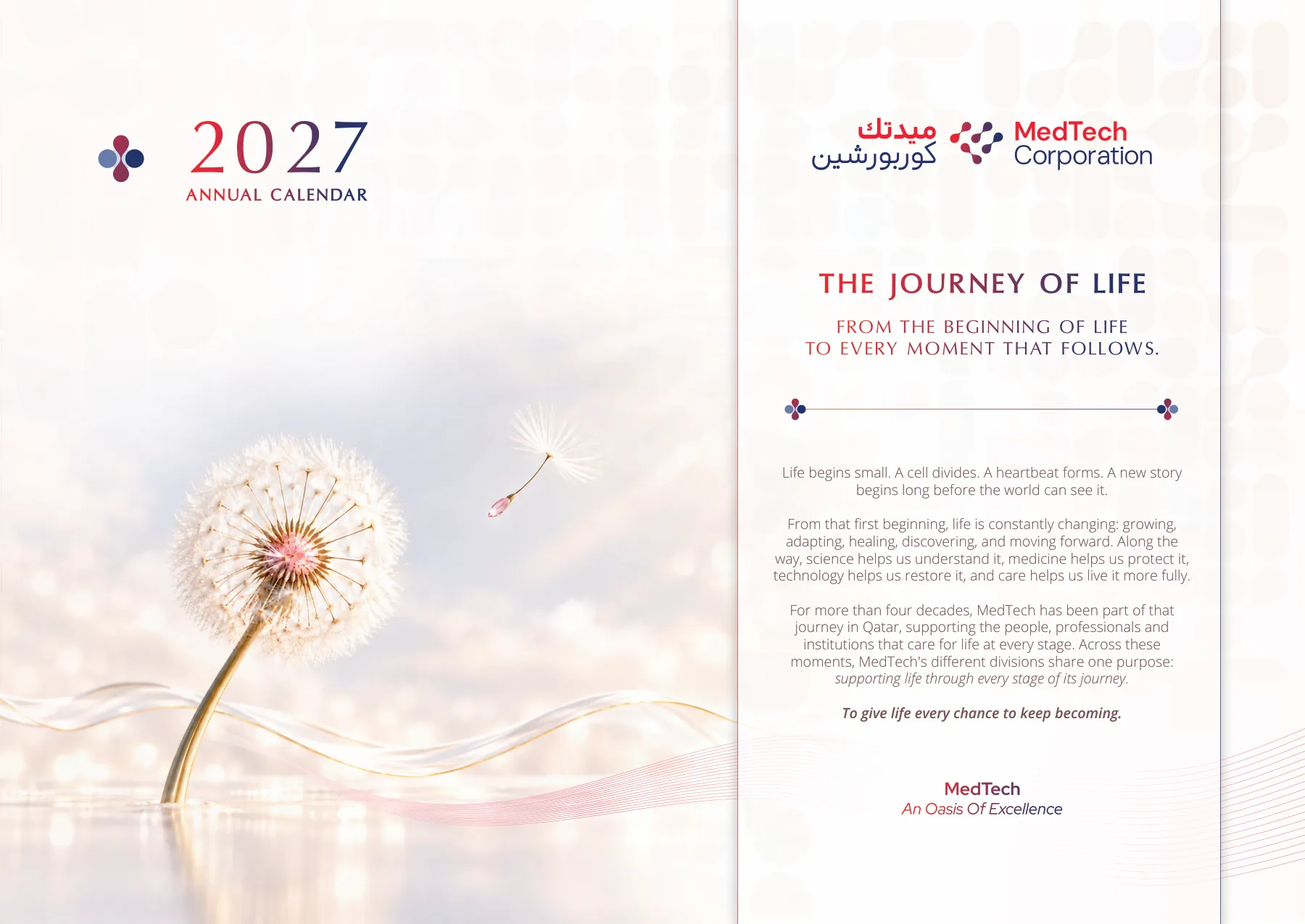
The annual calendars became an opportunity for this exploration.
Cover
01 / 14
One of the narratives explored was Qatar’s landscape, culture, and journey through MedTech’s perspective, connecting the country’s places, heritage, and transformation with MedTech’s long-standing presence.
The other explored was The Journey of Life, linking MedTech’s divisions to different stages of human life and the role healthcare plays across each phase.
MedTech as a fabric
woven into Qatar
The same narrative depth extended into other brand materials. In the company brochure, the idea of MedTech as a fabric woven into Qatar positioned the brand as something naturally interlaced with the country’s healthcare progress, partnerships, communities, and systems of care.
Together, these touchpoints helped MedTech’s identity gain a wider cultural and emotional range, rooted not only in healthcare, but in Qatar’s history, traditions, places, people, and evolving story.
A brand world with
room to continue
The MedTech project resulted in a more connected way for the brand to express its 40+ year healthcare legacy across identity, storytelling, corporate communication, digital platforms, events, cultural communication, and ongoing brand applications.
The work helped MedTech present its credibility, expertise, systems, partnerships, and presence with greater clarity, consistency, familiarity, and confidence. From profiles, brochures, presentations, website, social media, event videos, pitch decks, calendars, and seasonal campaigns, the brand gained a system that could adapt without losing its identity.
For Toruss, the collaboration became an opportunity to be a creative partner for an established healthcare organisation with a brand language built to evolve across new audiences, partnerships, and touchpoints.
Reflections
MedTech was one of those projects that slowly opened up in layers. It allowed us to explore how a brand system can be shaped through one central story.
The idea of Journey did not remain as a theme in the background. It gradually informed the narrative, visual language, motion, cultural communication, company profile, events, and everyday brand applications. Each layer opened a different way to express MedTech’s legacy and its relationship with Qatar.
For our team, the project was meaningful because it allowed strategy, writing, illustration, design, motion, and digital thinking to work from the same core idea, while still finding different forms of expression.
It reminded us that a strong brand story is not just something a brand says.
It can become the system through which the brand is seen, understood, and remembered.It can become the system
through which the brand is seen,
understood, and remembered.